Sunday, Jun 8
6:45:41 AM
01: Creating a scalable page layout component for
a design system.
→ REBELLION DEFENSE
Creating an adaptable page component
for a design system✹
Creating an adaptable page layout component for
a design system.
Aug 2022 / Rebellion Defense
Aug 2022 / Rebellion Defense


Project at a glance
PROJECT AT A GLANCE
ROLE
Product Design Intern
ROLE
UX Designer & Researcher
YEAR
2021 - 2022
BRIEF SUMMARY
For my capstone project at my UX Bootcamp, I wanted to understand and reimagine what goal tracking looked like for busy adults.
TEAM
Front end Engineer, Product Design Intern
BRIEF SUMMARY
As part of my internship at Rebellion Defense last summer, I co-led a month-long project to help reduce design debt and create a page pattern component for a budding design system.
OUTCOME
Our team released the page layout component alongside detailed documentation to the design system.
Why a page pattern component?
Why a page pattern component?
Similar data concepts exist across the Rebellion product line, but designers were still building wireframes and prototypes from scratch. The result? Inconsistent design patterns, repeating page layouts, and a lot of design debt.
Why a page pattern component?
Similar data concepts exist across the Rebellion product line, but designers were still building wireframes and prototypes from scratch. The result? Inconsistent design patterns, repeating page layouts, and a lot of design debt.
How I measured success
How I measured success
My success metrics were whether I could shorten the time to prototype for designers, reduce design debt, and identify gaps in Boba. This last metric was crucial for our front-end engineer to be able to prioritize certain components based on need.
How I measured success
My success metrics were whether I could shorten the time to prototype for designers, reduce design debt, and identify gaps in Boba. This last metric was crucial for our front-end engineer to be able to prioritize certain components based on need.
Design process
Design process
researching
existing
patterns
In order to create an adaptable component, we needed to first research and collect existing screens, identifying the overall intent and page type of each one.
Researching existing patterns
In order to create an adaptable component, we needed to first research and collect existing screens, identifying the overall intent and page type of each one.


Exploring new ideas
The other intern and I took our identified patterns and started exploring alternative ways to represent the concepts in each page type. Our component would need to accommodate datasets in different forms, so we had to think outside of the box.
Exploring new ideas
The other intern and I took our identified patterns and started exploring alternative ways to represent the concepts in each page type. Our component would need to accommodate datasets in different forms, so we had to think outside of the box.


continuous feedback
Later, a review session with our engineer helped us breakdown the rationale behind each design.
We used this feedback to iterate each others sketches. From here, we were able to identify which page types would have the least amount of constraints, thus, would need little refinement and consideration.
continuous feedback
I wanted to associate 'goal mapping' with the idea of a navigational map; an explicit guide to reaching your destination or long-term goal. This would allow interactive abilities and customization, another aspect I learned was important to users.


INItial page
prototypes
Focusing on the basic list view and detail view layouts, I visualized my sketches into med-fi mockups.
After discussing with my team, however, I realized the detail view required more consideration than we had time for. So, I focused on the basic list view view from here.
INItial page prototypes
Focusing on the basic list view and detail view layouts, I visualized my sketches into med-fi mockups.
After discussing with my team, however, I realized the detail view required more consideration than we had time for. So, I focused on the basic list view view from here.


Components and abstractions
Components and abstractions
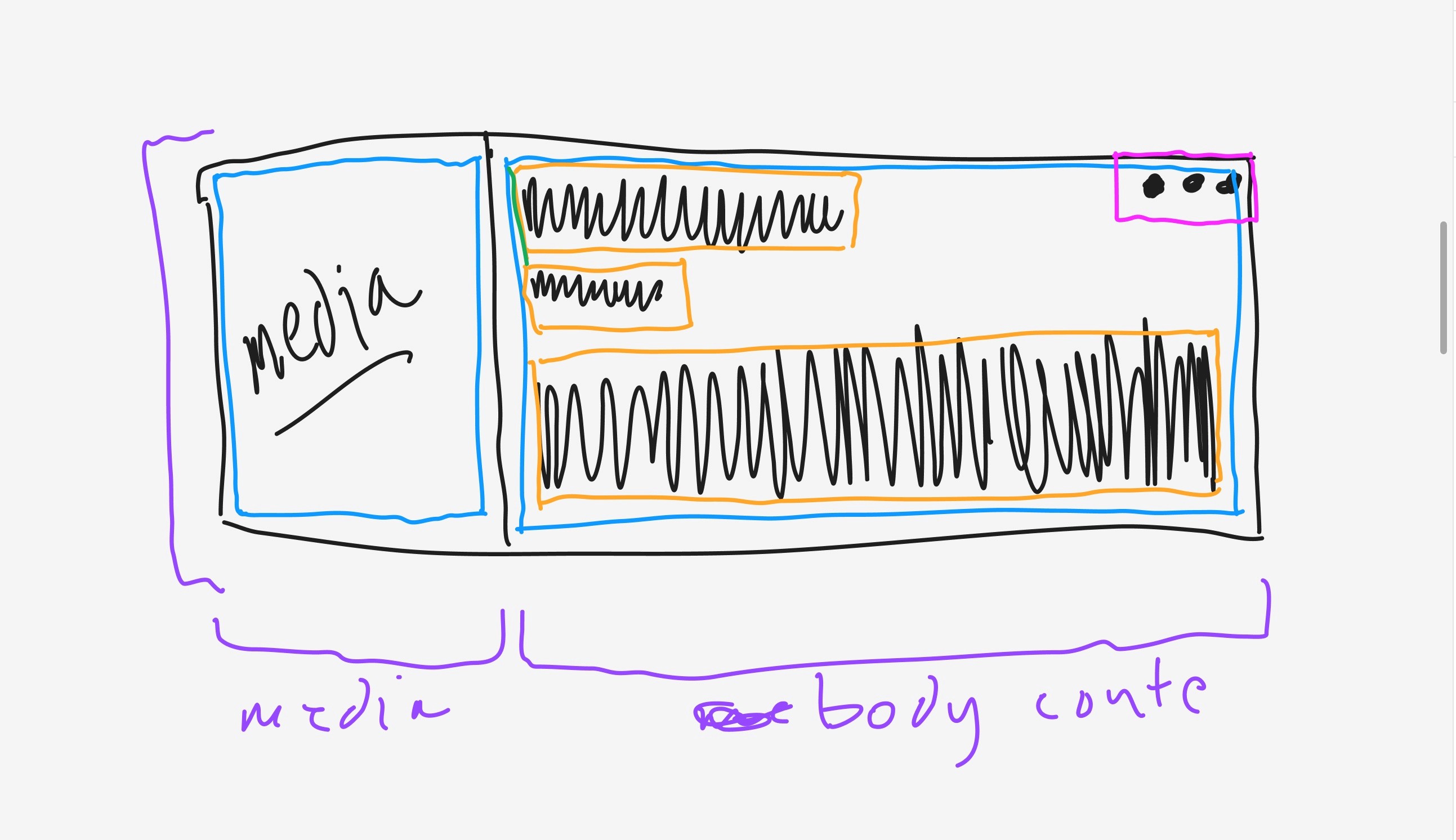
Then came the fun part: identifying the components and groups in the page layout.
Then came the fun part: identifying the components and groups in the page layout.


I worked with our UI Engineer to break down the content groups, so that applying auto-layout would be easy.
I worked with our UI Engineer to break down the content groups, so that applying auto-layout would be easy.

Project takeaways
Project takeaways
What I learned and what I did afterwards
What I learned and what I did afterwards
This was a challenging process, as this was my first time leading the research and design of a product. I'd certainly do things differently next time (interview more users and do a card sorting test before designing the IA), but ultimately, this project served as a study in self-reflection. In the future, I'd like to conduct another usability test with the new designs to ensure the app is effective and usable.
After the project, I wanted to explore design systems more and self-initiated a "component clean-up" for one of our products. I updated visual components that were outdated, and helped ensure consistency for Boba and for our end users.
What I learned and what I did afterwards